Lost

Status
Not open for further replies.

Smart $

Esteemed Member
Location
Ohio
Search functioning differently

Search functioning differently

In the previous version, when there were many new Today's Posts not read, I did a "blank" search using my own user name and a time frame of 3 months and newer, to get to new posts in threads I had participated in.

When I do the same search in the current forum version, I only get the threads I have participated in the last couple days... its like search does not recognize my user name in all threads of the former version.
 

gar

Senior Member
Location
Ann Arbor, Michigan
Occupation
EE
101231-1017 EST

Some comments on format:

Too much unnecessary garbage. Too much repetitive clutter.

Everywhere date and time is too complex.

Use 24 hour time instead of AM and PM and start at 0 for midnight at the start of a day, and only increment up to 2359. Whether the unnecessary : is between 23 and 59 I don't care, but it is really unnecessary.

For date simply use 12-31-10 and not / in place of -. Note 12/31/10 is not as readable as 12-31-10.

Within an "active forum" index move the "Replies/Views" column fully to the right. At the heading of the column put "Replies/Views", and leave these excess words out of each entry. Thus, an entry might look like:
Code:
[FONT="Courier New"]
     7   141
    21   656
     3    25[/FONT]

Under the "Title/Thread Starter" column it seems that the repetition of "Started by" in each entry is unnecessary. I do not even think the word by in each entry would be necessary. Just the name seems sufficient.

The "Last Post" column would move to where count column is located.


Main Forum Index.

In the main forum index I would make the same change to the "Threads/Posts" column as outlined above. Move to the right most column and eliminate "Threads" and "Posts" from each entry.

In the "Last Post" column I would make the subject bold, leave the respondent bold but possibly a slightly smaller font.


The purpose of these comments is to simplify what the reader sees, but convey the same information, and to attract the eye to the most important element of information for the current page of information.

.
 

goldstar

Senior Member
Location
New Jersey
Occupation
Electrical Contractor
Is there any way we could get the print and boarders in the actual posts to be a bit darker instead of light gray and powder blue ? Us old guys have a problem seeing. I have to shut the room lights just to see the screen.:mad: And I call myself an electrician:confused:
 

Jacob S

Senior Member
Just wanted to say thanks to the webmaster for keeping this place running great. I am already used to the format and I seem to like it better than the old. I agree about making some of the colors darker, but that's about it. And PS...please don't permanently change the time format to 24hr military time...
Thanks again!
 

mivey

Senior Member
I leave you guys alone for one minute...

I do not like the white back ground as it is hard to see. Maybe sunglasses will help.:D
 

hurk27

Senior Member
Anyone notice that there is no time in the list of post after you hit the "whats new" and it doesn't list the post in the order of the last post time? I was always use to looking to see which post have been recently posted to?
 

brian john

Senior Member
Location
Leesburg, VA
Being on the more than STUPID side of the majority of members is there a guide to using the new forum. SO FAR I find it a PIA to work around.

I have no clue what different colored post mean. For starters?
 

George Stolz

Moderator
Staff member
Location
Windsor, CO NEC: 2017
Occupation
Service Manager
Anyone notice that there is no time in the list of post after you hit the "whats new" and it doesn't list the post in the order of the last post time? I was always use to looking to see which post have been recently posted to?
You mean that the current date format pushes the time out of view?

This is what I see when I look at "What's New", and it looks like it is in order, if you scroll down a ways to see a first digit of the time other than zero.

I have no clue what different colored post mean. For starters?
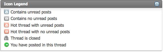
At the bottom of the NEC forum I found this:

IconLegend.jpg


Is that what you were referring to?
 

Smart $

Esteemed Member
Location
Ohio
You mean that the current date format pushes the time out of view?

This is what I see when I look at "What's New", and it looks like it is in order, if you scroll down a ways to see a first digit of the time other than zero.

...
The time displays by making your page view wider, close to 1300 pixels on my screen. A lot of wasted space in columns at that width... !!!
 
Status
Not open for further replies.
Top