208 from 3 Phase Wye

Status
Not open for further replies.
Didn't quite get it right. Peak for 208 & 120 is identical at about 170. The graph needs to show the area under the curve for the same wave, first a single 170V to neutral, then for three of them offset by 120 degrees. If you feed regular 5-15 receptacle power through a full wave bridge into capacitors you'll get 160-170 VDC. The next step would be to construct a 'tridge,' using all three phases at which point you'll get the same voltage. This is how DC buss voltage in drives is produced. Sorry I'm not a math teacher. This is a very abbreviated explanation.

Single sine wave (note sqrt(2)=1.4)
120 peak = (1.4)(120) = 170V
the area under a single 170V peak wave is about 120, the RMS value.

Three sine waves (note sqrt(3)=1.7)
(120VRMS)(1.73)=208
the area under the three waves = (area single wave)(1.73)
 
Pete

You lost me talking about the DC 208 volts is not the RMS of 170 volts AC it is the resulant voltage generated by the wye configuration.
 
ronaldrc
I think what he is saying it that in order for your graph to be accurate, the peaks of your sine waves need to be at + 170V (approx.) and - 170V. That way, when you take the rms average across the wave, you get the 120V that your AC meter reads. (its been too many years since I studied this in theory so I may not be explaining it correctly, but I hope you get the idea!)

edited for spelling correction!
 
Ok I got it now, but he should of just said the peak should show 170 VAC instead 120 even I would understand it.

But I see what he was trying to demostrate.

Thanks:Ronald
 
ronald,

You have 3 phase voltages of 170V amplitude peaking at 90, 210, and 330 degrees. This is correct.

You should also have 3 line voltages of 291V amplitude (208Vrms)peaking at 60, 180, and 300 degrees. (corrected 3/14)

Just draw the phasor diagram and it will be clear as mud.

Takes a little trig to compute this.
 
Sorry that I wasn't clearer. You should hear me talk. To paraphrase Thomas Reed, a contemporary of Edison, I 'never open my mouth without subtracting from the sum of human knowledge.' :?
 
Hello Pete and Rattus

Pete thats a good way to prove that 120 RMS is really 170 Peak voltage.I just never thought of showing it that way.

Rattus I never did believe the old wise tell, This Dog is too old to learn new tricks' but this old Dog is too worn out and tried, but I will work on it.
 
I should have mentioned this at the first of this thread.

About a year or so ago we got on the subject of three phase wye and where discussing how it is generated.

What I posted is what everyone at that time more or less agreed upon.
I'm sure some didn't take a great interest in it and just agreed.

The theory was at every 60 degrees and when one of the phases is equal to zero this is when a 208 voltage appears. This would mean that for every cycle 208 appears 6 times.

I personally do not completely buy this theory.

I will ask the question again is this correct?
 
ronaldrc said:
The theory was at every 60 degrees and when one of the phases is equal to zero this is when a 208 voltage appears. This would mean that for every cycle 208 appears 6 times.

I personally do not completely buy this theory.

I will ask the question again is this correct?

According to the graph you posted, yes.
 
ronald,

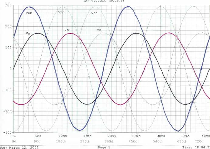
Whenever one of the phase voltages is zero, the other two are plus and minus 0.866 x 170V. The difference is these two voltages is 294V which is the peak value of 208Vrms.

The 208V waveforms look just like the 120V waveforms except that the peaks are larger and the peaks occur at different times.

Take a pair of dividers and manually plot the difference between any two phase voltages to get a handle on it.
 
Here is the rest of Ronald's diagram at 50Hz:

Note that the wye phase voltages, Va, Vb, and Vc peak at 170V and the line voltages, Vab, Vbc, and Vca peak at 294V.

Line voltage such as Vab is determined by the DIFFERENCE in phase voltages. For example,

Vab = Va - Vb

These traces are colored in to make them stand out. Anyone interested can print out this diagram and finish the coloring job.

3PHASE1.jpg
 
Rattus

Your graph looks great,not being real good at math and trying to figure the graph just from what little I know about the interaction of waves I think it is correct.

Not being as smart as most on here I have a lot of trouble figuring these thing out.

I tried to duplicate your graph with MSworks spreadsheet but couldn't do it.I know there is probably away but I don't know how.

Maybe Steve or someone can help in that area.

Thanks for the graph Rattus:Ronald :D
 
Ronald, I think your spreadsheet arguments must be in radians rather in degrees.

180 degrees = 3.14 radians

90 degrees = 1.57 radians, etc., etc, etc.

Oops! My keyboard misspoke!
 
Rattus my sines are with sin to form the sine waves with my graphic spread sheets. I think Steve 66 originally posted how to write that spreadsheet a couple years ago.

Maybe Zif is talking about the 30 degree phase shift in the resulant waves. :?
 
I'm not sure if this is what Zif meant, but Rattus posted:

You have 3 phase voltages of 170V amplitude peaking at 90, 210, and 330 degrees. This is correct.

You should also have 3 line voltages of 291V amplitude (208Vrms)peaking at 0, 120, and 240 degrees.

The 208V line-line voltages peak at 60, 180, and 300 degrees. They lag the line voltages by 30 degrees. That's the way you have them on your chart - I think everything on the chart is correct.

As far as plotting this in Microsoft Works, I'm not sure if it is the same as Excel. With Excel, Rattus is right - you either use Radians, or convert them like "sin(x * 180/pi). (There might be an option to change to degrees, but if there is, I can't find it offhand).

I like to use the "Edit, Fill, Series" function to fill a column with a lot of numbers. In about 10 sec you can have a column of 3600 numbers going from 0 to 360 degrees in 0.1 deg. increments. Then in the next column, just use the "Edit, Fill, Down" to copy the same formula.

As far as inserting the chart, in Excel it is the "Insert, Chart" option. I'm not really familiar with all the options for charts, but you can probably figure it out with trial and error.

Once you have that, it should be pretty easy to create another column for a shifted sine function, and a 4th column to add the two sine waves. Maybe someone else can tell you how to plot more than one function on the same graph.

Steve
 
Status
Not open for further replies.
Top