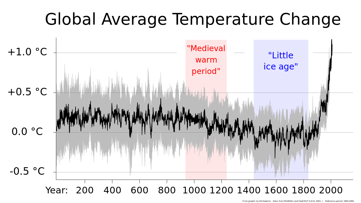
A few comments on your last post with graphs:
- Why are you using the range of 1900 to 2014 instead of the full data set?
- You've only differentiated once in your graphs.
- I don't know enough about data analysis to analyze such a noisy graph, nor to know if we should expect a trend line.
- I'm pretty sure whatever graphs you come up with, subject matter experts and the IPCC have looked at them. My time to duplicate their work is not infinite.
Cheers, Wayne
-I matched the temperature range to the graph of fossil fuel consumption. If I'd found a consumption graph going further in either direction, I'd have extended the temperature graph likewise
- Mmmmm, well you may be right there. Lessee, each point on the graph is a temperature at a particular time, so sort of like position at a particular time? If I don't change my position with time, I get a horizontal line. If I move at a steady pace, a graph of my position is a line with constant slope where the slope is proportional to my velocity. So a least squares fit on the temperature graph should give you the "velocity" of temperature. The derivative function on that graph takes the value at t
1 and subtracts it from t
2 and plots the value. That's the velocity going from t
1 to t
2. Now, the least squares fit of all those measurements will be the acceleration, just like the least squares fit of the position graph was velocity. So, I think I may have used the wrong nomenclature, but graphed the correct result.
-I can't help you there but if temperature was going up faster, you should see it in the graph, because world AGW CO2 production is rising year-over-year.
-The IPCC is a political body, not a scientific one. Therefore, it is driven by political considerations. It is interesting that the IPCC's remit was limited to
only looking at possible AGW and they were not tasked to examine natural causes as well.


